Score Visualization
Map the tempo journey through any score.
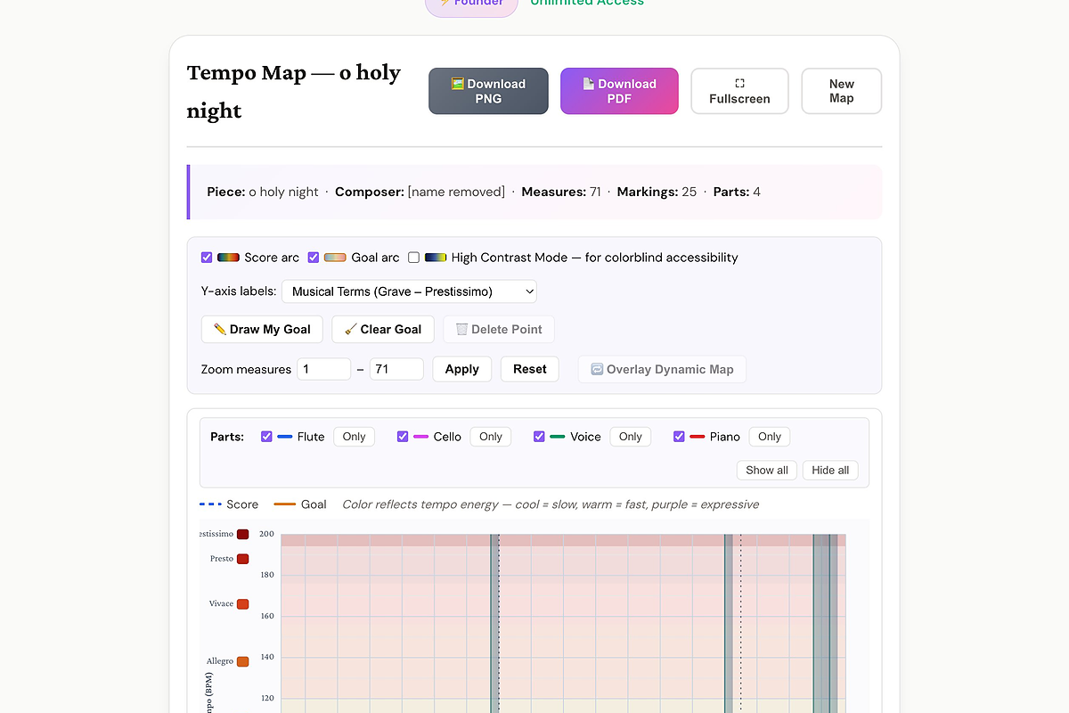
Upload a score and MusEdLab plots every tempo marking — Grave to Prestissimo — on an interactive BPM grid across every measure. Sketch your own teaching-goal arc on top and see exactly where your interpretation diverges from the printed markings. A powerful tool for conductor preparation and for helping students understand a piece's pacing.
Free to start. No credit card required.
What you get
-
Full BPM grid Every tempo marking placed accurately on a Grave-to-Prestissimo y-axis, across all measures.
-
Draw your goal arc Click to plot your interpretive tempo arc and compare it visually to the printed markings.
-
Color reflects energy Cool colors = slow, warm = fast, purple = expressive — makes the pacing story obvious at a glance.
-
Multi-part view Show or isolate individual parts to see if tempo markings are consistent across the score.
-
Overlay Dynamic Map Overlay the dynamic arc on the same canvas to see how tempo and dynamics interact.
-
Download as PNG or PDF Export for your conducting folder or share with students as a study aid.
What the output looks like